a DH Downunder 2020 course, Bill Pascoe
(note this text is in the process of being updated – apologies for glitches)
This course is created on the land and waters of Awabakal people.
Learn how to create digital maps and spatiotemporal data for Humanities. With no prior experience required, this course will cover some fundamentals of mapping theory and techniques, and provide step by step, worked examples that can be adapted to your projects. ‘Mapping’ in humanities isn’t just putting points and lines on a map. A wide range of other possibilities for humanities will be considered, from various visualisations to metrical analysis. This course provides an overview of mapping concepts and what sorts of digital mapping activities can be undertaken in humanities.
No prior experience with coding, web development or GIS is needed. You can focus on the parts you find most interesting.
You will need: This is a free course with no hidden expenses and minimal requirements. The following will be useful:
- A free text editor such as Notepad++ or Komodo Edit is an essential part any digital humanist’s toolkit. (Note you only need the ‘Edit’ version not the ‘IDE’. Free applications like this often promote the paid version strongly, so if you encounter a demand for payment you have probably been misdirected to the paid version. I say this to avoid obligating people to pay but if you do have money, go ahead and donate since free software helps everyone.)
- MS Excel or similar spreadsheet software, is desirable.
- A Google account for accessing Google My Maps and/or Google Earth. You can still do this course if you don’t want to create a Google account or use their systems.
- S Excel or similar spreadsheet software, is desirable.
- A Google account for accessing Google My Maps and/or Google Earth. You can still do this course if you don’t want to create a Google account or use their systems.
What is a map?
The word ‘map’ is used in different ways in different disciplines and contexts. This course will focus on the usual meaning of maps as visual representations of information about geographical places. It is worth understanding other meanings of the word ‘map’ as they are related and can inform out thinking.
Cartography
Typically when we say ‘map’ we are talking about a two dimensional picture of relationships among geographical places, providing some kind of information about that place and helping us to navigate. Such pictures usually depict distances between places that reflect the proportions in the real world.


Maps in other media
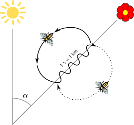
Maps are not necessarily 2D proportional pictures. They may be oral, such as when we ask for directions. Travelogues, such as Ibn Battuta’s and Marco Polo’s Travels can be seen as maps in the medium of text. Maps do not necessarily aim to match spatial proportions in exact ratios. Indigenous meso-american lienzos, such as instances of the Mapa de Cuauhtinchan of Chichimec people, incorporate pre-Columbian writing systems to narrate journeys and establish political relationships. Some ancient Mesoamerican codices are glyphs that represent places. These glyphs can take up a whole page and themselves incorporate many other glyphs which can involve deep and extensive reading of stories, multi-layered symbolism, and ‘word-play’ that is both visual and phonetic – involve detailed reading in themselves, as demonstrated in the Yuta Tnoho Tree Glyph. Some maps, such as itineraries, focus on distance measured in travel time rather than space. In Wunungu Awara we can listen to songs and dreaming stories with animations from many Aboriginal and Torres Strait Islander peoples. Such stories combine and connect knowledge about navigation, law, ceremony, land-care, food, spirituality and stories with country. Virtual Reality constructions are another form of representing space or ‘maps’, such as Virtual Songlines or the Beacon Island visualisation. There are 4K walking tours and 3D panorama visualisations. We can even consider the dances of bees to be maps – a representation of the world that other bees use to navigate.
Maths, Software and Intelligence
A ‘map’ is a relationship between two sets of numbers. One number in one set ‘maps’ to another number in the other set. The ‘map’ is typically expressed by a ‘function’ which is a procedure for finding the number in one set given the number in the first set, or to put it another way, to transform one number into another. For example, the function of ‘plus 1’ maps 1 to 2, ie: 1+1=2. It maps 2 to 3 and maps 156 to 157. The function ‘squared’ maps 1 to 1, 2 to 4, 3 to 9, 4 to 16, etc. This is a large and complex field in maths.
Possible journeys between nodes in a network is part of a branch of maths called Graph Theory. It was begun by Euler in 1736, trying to solve the problem of finding ways to cross all 7 bridges of Konigsberg, modern Kalingrad, once and only once. In digital humanities when people say ‘maps’ they are sometimes talking about network diagrams or ‘graphs’ in this mathematical sense, and not about geographical maps, for example Six Degrees of Francis Bacon.
Advocates of using networks in digital humanities often promote them as a good way to visualise, explore and interact with information, enabling patterns to be more easily seen, and the ability to identify important ‘hubs’ that connect many others together. A common criticism of their use though is that they sometimes provide only a colourful image that looks impressive, but do not provide us with information or teach us anything. They can be too crowded and messy to make sense of, or are not supported by metrical analysis to demonstrate the point in a rigorous way. Such ‘maps’ need to be used well, to be informative.
This mathematical meaning of ‘map’ is crucial to software development. In software development we are almost always, at the end of the day, ‘mapping’ input to output, whether it is a function in a programming language, or user actions to feedback on the screen. This is generalisable to mapping a mouse click as input, to some process such as looking up something in a database, and showing the results on the screen as an output.
This is similar to what the neurons in our brains are also doing, in a massively connected way, and the process of ‘learning’ involves modifying those connections to ‘map’ neurons to each other, and perceptions and thoughts to actions. This understanding of how brains work – as a network mapping problem – informs artificial intelligence.
With these possibilities in mind it is important to consider what the purpose of your map is and to what extent it satisfies that role. The following are all valid reasons to create a map, but it is important to be clear about what your map is intended to do. A map may do any or all of these, and there may be other roles it performs. Is your map intended to:
- Illustrate: A map might only be intended to provide visual representation to aid understanding or encourage engagement with your research, such as by providing an illustration. You are talking about some places, so you show them on a map to help the reader understand what you are saying. (eg: a map of places mentioned in Sherlock Holmes novels can add to enjoyment, appreciation and understanding of the book, and even contribute to a tourism trade, without necessarily leading to any new knowledge or providing evidence for an argument you are making in an academic paper).
- Access: A map may function as a research tool, such as a front end to organise information by place, so that people can look up details related to places.
- Demonstrate: Maps can help prove a point by testing a hypothesis. For example, you may wish to test a theory that Australian crime fiction is significantly biased towards rural settings. Simply illustrating where crime fiction is set on a map would not be adequate. This would require mapping settings of crime fiction as well as rural, suburban and urban areas. From that we could see if most occur in urban or regional areas. Since we are talking about Australian crime fiction we might want to add a similar comparison with other parts of the world, to check whether this is simply true of crime fiction in general or peculiar to Australian crime fiction. To some extent the relationship could be percieved visually. Simply visualising can help spot relationships not immediately obvious in text. A more rigorous argument might include a metrical analysis, which can further show relationships and patterns you couldn’t see. This might simply be counting relationships of certain kinds in a spreadsheet, or by more sophisticated metrics measuring distances in time and space. Be aware that although coordinates can be expressed as numbers you cannot simply calculate statistics on them in the usual way because the earth is a sphere. Places on either side of the international dateline might be close together in reality, but in coordinates are very distant. A difference in longitude is a very different distance at the equator than it is at the pole.
- Model: Maps may be used interactively to model various scenarios and possibilities, not just describing the way things are. For example, a purely descriptive map might may show where historical epidemics occured, how people and medical personel responded and how successful this was. A modelling tool could enable you to explore what might happen, or would have happened if epidemics happened in other places, or there were different responses.

Semiotics
In the most general sense we could see representation and meaning as a ‘mapping’ of sign to referent, or a mapping sensory signals to meanings and actions. A word, symbol or any sign is not the thing that it represents – it is an association, in a chain or network of associations. Also, when we are making a map, and reading a map, we are embroiled in the process of meaning making. We choose what to put on the map, and what to leave out. Maps enable people to do certain things so involve agency and ethics. Maps have assumptions built in, are a tool for ontological and epistemic construction in discourses of power. They are cybernetic in extending our power and capacity to see and control what is beyond our immediate body, they provide ‘information’ to disambiguate and make ‘present’ what is not present. The full range of critical theory becomes applicable.
Create a map
- Go to Google MyMaps and sign in: https://www.google.com.au/maps/d
- Click ‘Create a new map’ button
- Click the ‘title’ to edit the title and description.
- Click ‘untitled layer’ to edit the layer title.
- Click ‘Basemap’ to change the basemap to satellite imagery.
- Add a point. Note you can add an image by clicking the little camera icon and change the style of the icon.
- Add a line. (Double click to stop drawing the line)
- Grab the mid point of the line and move it. Note that another mid point appears that you can also move.
Add data to features:
- click the little three dots next to the layer name and choose ‘Open Data Table’.
- Click the little arrow next to ‘Description’ and .
- Choose ‘Insert Column After’, and fill in the details.
- Add some data.
Import and Export Data
Never put work into a system if you can’t get it out again.
- Click ‘Add Layer’
- Click ‘Import’
- Choose a KML file or a CSV (A .csv file is a ‘comma seperated’ file. You can save an Excel spreadsheet with on column for latitude and one for longitude as a csv.)
- Click the three little dots near the title and choose ‘Export to KML/KMZ’.
- Note that you can choose to export the whole map, or a single layer.
- Choose ‘Export as KML instead of KMZ’. A .kmz file is a compressed .kml file and so uses less space. I usually use KML as I often need to read and edit the file.
You can send the web address of your Google My Map to people, or you might have your own website and you want to put the map on a webpage. It might be your Uni content management system, your own WordPress site, or your own web host. You can copy a snippet of code to embed the map on your own webpage.
- Click the three little dots near the title and choose ‘Embed on my site’.
- Copy the code snippet and paste it into your HTML or your content management system.
It should look something like this:
<iframe src="https://www.google.com.au/maps/d/embed?mid=1MAO6J3XB8zzQCfFyx8IFuqmL7BEiZmyd" width="640" height="480"></iframe>
Note:
You can import as CSV but you can’t export as CSV. This makes it tricky to map within MyMaps and maintain your data seperately and refresh one from the other without redoing things. You can search the web for free tools to convert between CSV, KML and GeoJSON.
Now you have made a map you want to do more don’t you? Maybe it’s tie it in with your database, or show stats for regions, or show change over time something.
Google MyMaps is great to make a quick and easy web map. A simple map can be very powerful. Sometimes the simpler the clearer the message is. If that is all you need, great. One advantage of starting a map project by putting some information in Google MyMaps, is that you very quickly learn it’s limitations – that means you very quickly clarify what you really wanted your map to do.
Coordinate Systems There are many different coordinate systems as scientists develop and improve on them. Some are based on spheres, some on the slightly distorted sphere shape of Earth, and some provide corrections to improve accuracy on previous systems. As digital humanists the mathematical intricacies of their differences are usually not as important as the ability to use them to produce a map. To indicate a place usually doesn’t require accuracy. It can become important to know which coordinate system you are using if you do require a high degree of accuracy and precision – archaeologists may need to pin point digs, and good accuracy is needed for road navigation, for example.
Coordinate systems are ways of specifying latitude and longitude. Latitude is the parallel lines drawn around the globe, or the horizontal lines on a map. Longitude are lines drawn from each pole around the earth, somewhat like a quartered orange. Latitude and longitude provide a point. Google maps uses World Geodetic System (WGS) 1984. It can differ to other system by around 1cm to 100metres. This is a decimal system.
Coordinates can be expressed in ‘degrees, minutes, seconds’ (eg: 32° 55′ 25.32″ S, 151° 47′ 0.996″ E) format or ‘decimal degrees’ (eg: -32.92370, 151.78361) format. Decimal degrees is easier for computers to process, and for people to use so is now much more commonly used.
Standard Open Data Format There are standard data formats for storing and/or communicating GIS data. Some common ones are KML (KMZ) and GeoJSON. A KML file is a kind of XML file. A KMZ file is a KML file that has been compressed. GeoJSON is a specific kind of JSON file. Data might often also be stored in CSV files or relational databases. CSV files are ‘comma seperated’ which you can see if you open one in your text editor. You can open CSV files in Excel and save spreadsheets as CSV files. They are often used for easily handling tabular data across systems. It’s important that data can be removed from, or made available in a standard format, to ensure it’s re-usable (even if it is only for yourself or to make a backup).
Geolocate Finding coordinates in latitude and longitude from some other information or device, such as with a GPS or from your computer’s IP address.
Geocode Providing coordinates for some object or name. Usually this means finding the latitude and longitude from a street address. To process a large amount of addresses may require using a paid service.
Georectify Adjusting a map to a coordinate system. This usually means overlaying an image of a map, such as an old map that might not be accurate, on a digital map and rotating and distorting it to match.
Map projection The earth is curved, a map is flat. The ‘projection’ defines the way in which the 3D curved surface has been translated into 2D. This always involves distortion. The most familiar rectangular map of the world, the Mercator projection, for example increasingly stretches out proportions away from the equator such that the points at the poles are stretched out to be as broad as the equator. Famously, the Mercator inflates the rich and powerful nations of the Northern Hemisphere and shrinks poorer equatorial and tropical countries, so that a more proportionate map, the Gall–Peters projection, was adopted by some. As humanists we must bear in mind that everything, even the ‘objective’ science of mapping technology, is political.
Layers The type of information on a map is typically called a ‘layer’. We might add a layer of soil types, a layer of river systems, a layer of towns and cities, and a layer of the data we are particularly interested in. Maps are something we read. They are something we write. The way we draw the map and what we draw on it is always chosen. These choices are influenced by cultural and personal assumptions and the particular purpose of the map. Marshall Islanders have maps of ocean currents, local councils have maps of water pipes, armies have maps of strategic positions, pirates have maps of treasure. Because maps are intended to convey knowledge, and this is typically for a purpose, they play a role in human agency and power. Some maps promise adventure and the chance to learn from the unfamiliar, other maps are more sinister when we understand what they were used for.
Basemap Usually we want to put information on a map. The map we put the information on, or the layers on, is called the ‘basemap’ or ‘base layer’. Mapping systems typically come with a variety of options for the basemap of the world – terrain only, road maps, showing place names or not showing place names, and so on.
Points, lines, polygons When using mapping software, most information is displayed as either a point, a line, or a polygon. Lines may be irregular, such as the path a road takes, and shapes may be squares, circles or irregular drawings. Drawing polygons can be very time consuming, so normally you would not contemplate this unless there were only a few places you wished to outline, or if you can get the outlines from somewhere else. Another drawback in many systems is that lines and shapes can only be drawn without curves, making them somewhat clunky to look at. You can usually only simulate a curve or circle by adding lots of angles.
Image overlays This enables placing an image over the top of a map, by specifying where the corners of the image should go. In this way we can display old maps, or well drawn outlines, over a contemporary map for example, with ‘show/hide’ toggles and transparency. Some tools allow distorting the image so that old map features match exactly the current map.
Metadata Typically we are not only mapping coordinates, but sites that have a lot of other associated information. This metadata about a place is what you would often find in a pop up when you click on a point, or it may be part of the visualisation, for example being used to determine the colours or size of dots to convey intensity. Metadata also includes the information about the dataset as a whole – who created it, what the terms and conditions of use are, etc.
Getting Coordinates
To simply find the coordinates of a point, two of the quickest ways are:
- Go to TLCMap’s Quick Coordinates and click the map.
- Go to Google Maps and right click the map (this was recently added).
Common Coordinate Glitches
Common glitches include error messages, points not showing up on the map at all, or appearing off the West Coast of Africa in the Atlantic Ocean (ie: lat, long has defaulted to 0,0 in the event of a problem)
Some common causes of glitches:
- The coordinates might need to be in a separate column for Lat Long, or a single column separated by a comma
- Comma separated coordinates may either need or not need a quantity for ‘elevation’ which can just be another value (0 by default) on the end of the coordinates. Eg: 79.5938731,28.7722918,0
- The coordinates may be the wrong way round. Unfortunately, some systems export in as lat,long while others expect input as long,lat.
- There’s a typo or number written the wrong way. eg: 79.593E731,28.7722918
- You are using the wrong, or a mixed coordinate system, such as the system expects decimal “44.4604788, -110.8281375” but you have degrees minutes seconds “44°27’37.7237″, -110°49’41.2950”
Digital mapping can be used in land and water care, native title, and to educate people about culture and country. There is much non-indigenous people could learn from indigenous knowledge of country, mapping technology, and the meaning of place – if done in the right way. As just one example, this should be clear after the unprecedented, massive and catastrophic bushfire season of 2019-2020 in Australia and the need for indigenous fire management.
The situation for indigenous people is different in different places around the world. Consider how different the history and present day is in Ireland, Brazil, Australia, Algeria, India, Iceland and Liberia. There are some similarities and some common causes for indigenous people. Because this course is in Australia, the following will focus on indigenous people in Australia, Aboriginal and Torres Strait Islander people. If Australian culture is world famous for anything it is the world’s oldest living culture, a culture for which connection to country and the ability to map and navigate it is of vital importance.
Learning About Digital Humanities Mapping From Traditional Mapping Technology
With more than 200 languages, nations and peoples in Australia there are as many styles and genres of art, songs, corroborees and stories, traditional and contemporary. This are often related to the landscape, both as navigational tools, and as stories that relate to law and ceremony, and where and when to get food. Art styles range from Yolngu crosshatching style in the north to possum skin cloaks in the south and dendroglyphs in the east. Perhaps the most internationally famous style is Western Desert ‘dot painting’. It is both contemporary and ancient including iconography many thousands of years old, or from the dreaming.
Clifford Possom Tjapaltjarri’s Warlugulong is a good example of how, visual art is not distinguished for other art forms but is also at the same time writing, in which stories can be read, and a map of country, and a law code. In it can be read 9 different Tjukurrpa (dreamings) overlayed on each other, some of which start and end outside the region depicted. Often in imagery and stories there are multiple meanings for initiates and non-initiates. Some elements require close scrutiny to discern. It’s worth trying to learn to read paintings like this, because it is often in the detail and in the specifics of the place and the connections made that you start to appreciate their richness and depth. I wish I could elaborate on all I’ve been able to read in this painting, but there isn’t enough time and space here in this course, and you should go on your own journey to find it in books and other places and hear it for yourself from better sources. As a start you can see in this painting the ashes of the region burned by fires, various camps and waterholes, and you can see the differences between human, possum, emu and kangaroo tracks (which also represent different social groups).
To hear and learn the story you have to make the journey, so that when you recall the story, you remember the journey. In hearing the story, and seeing the image, the country itself, as you walk though it, becomes the ‘text’ in whch you can read those stories, and the lessons they embody. It is a technique in classical Western oratory to remember a speech by imagining walking through a space in which you have mentally placed reminders of all the points you want to make. So to, remembering the journey through country helps remember the story, and so on, each aspect reinforcing and reminding in a deeply layered and interconnected mesh of meaning and memory.
One of my favourite stories is Yarmurnturrngu and How I Came Back to Yajarlu told by Jacko Ross Jakamarra because when I first read it in Warlpiri Dreamings and Histories it made no sense so I knew there was a lot I couldn’t understand. To me seemed to just be a series of disconnected and unrelated events, and so not really a story but ‘just a bunch of stuff that happened’. Why? The clue was in the first line – “This is the dreaming that belongs to Yajarlu…” It is only those parts of stories that belong to a certain place that a certain person is allowed to tell. It’s as if there were some place it’s ‘meaning’ was ‘This is the place were so and so passed through on their heroic adventure, and this is also the place where, later, there was that tragic event, and where also, these two people met on their way to…’ All the rest of the story is already popularly known – the meaning of the place is built up through those layers of intersecting stories and interconnected people and places.
“They awoke and the two of them travelled a long way. The sorceror’s fire woke at the same time, always present, always present. The fire chased them away from here, always further off it chased them, and they became more and more badly burnt. As they put it out, it consumed their feet. It ate their feet, their knees, their heads until their skin was covered in burns. At this point in the journey, the story belongs to the Pitjantjantjara.” – Nampijinpa, Uni (Warlpiri jukurrpa) ‘Warlukurlangu, What Happened at the Place of Fire’ in Napaljarri, Peggy Rockman & Cataldi, Lee (translators) Warlpiri Dreamings and Histories: Newly Recorded Stories from the Aboriginal Elders of Central Australia Newhaven: Yale University Press, 2011
“If one is not prepared to take the trouble to go to the place, then its story can only be given as a short version. If one expects, following Western traditions, that each person will be the sole source of a story, then one will be surprised to find a contrapuntal polyphonic style as a group of men or women gather together to collectively produce the text. Similarly, authority is deferred: “That’s about as far as the story I can give you… you might be able to get the other half from … Killer”, said a man in Looma as he saw the story was telling disappear over the horizon into another man’s country.” – Benterrak, Krim; Muecke, Stephen & Roe, Paddy Reading The Country: Introduction To Nomadology Fremantle Arts Centre Press: Fremantle, 1984
The first of these quotes is one of the main stories in Tjapaltjarri’s Warlugulong. They both show how different people are responsible for the stories of different parts of country. If you want to hear the full story, you have to make the journey to visit them all. In this way, people remain connected to each other, making those journeys, the story helps remember the journey and the journey helps remember the story, and everybody is important as a vital connection in the whole.
Maps and Translation
Clifford Possum Tjapaltjarri’s Warlugolong shows how indigenous ontologies and ethics can be translated across cultures. This work is a landmark masterpiece in Australian and indigenous art. It is both traditional in using traditional symbolic systems to represent songlines, and contemporary in using the western convention of oil on rectangular canvas, it’s ‘abstract’ aesthetic, and invention of the dot technique, and the figurative elements such as the skeletons are not traditional but there to help non-indigenous people read it, as a illustration in a book would. It is also a map, and a text. As with any translation, it is not exact, something is lost and something gained.
Digital humanities is my work, and it is a combination of humanities theory and applied craft – technology. I have learned as much about how to do Digital Humanities mapping, about how to do this work with maps about the ‘meaning of place’ and so on, from this painting and other stories and in trying to learn to read other places in Australia, as I have from any other source. For me, ‘how to do digital humanities mapping’, has come to be a matter of figuring out how to apply these principles on the web and in software design. Some of the things we can learn about how to do mapping from indigenous mapping technology, through this include:
- Country is an organising principle to navigate knowledge. Just as a book may have contents and an index to help navigate it and arrive at our destination within it, so too a map can provide an effective, non-linear, ‘user interface’ to information.
- A map can exist in many media, not just a 2D lattice of longitude and latitude. It can exist as a story, song, dance, painting, etc.
- The meaning of a place is across many layers.
- The meaning of a place isn’t in isolation but through its connection to other places in a mesh of intersecting lines.
- Mapping is personal. Each place and part of a story is in the responsibility of an individual. If anyone wants to hear the whole story they must travel to see that person and learn from them. Being connected to a place, understanding, and holding its story, means you are important to the longevity of culture, of the meaning of that place. When we look at a map we see our part in a greater whole. We see where we stand in relation to the world. Understanding the stories associated with places, enhances our personal connection to where we grew up and where we live and work.
- Mapping is social. As the meaning of each place is in its connection to others the whole story involves connections to each other. To understand the whole of which we are a part, we need dialogue and social interaction. Broadly defined culture is shared experience – not just those experiences unique to me (though the personal and the cultural are an interplay). By learning the meaning of the places we inhabit we are connected to our past and our future, and generations before and to come. Our individual lives are more important because we are a vital connection in that yam vine greater than ourselves. In a sense, because our own experiences are shared, the same things done, felt, understood, lived through, with people before and people to come, culture is life’s answer to death, it is how we survive death.
- Having learned the meaning of a place through a map (painting, sand, words, etc), the meaning of that place is evident when next we see the land and water features, or the buildings. A map is a tool for teaching us ‘how to read country’. The land or place itself then means the lessons of the story. More broadly places tell the story of our history and being in them, and remembering being in them, is a mnemonic for that history, which is identity forming – how we came to be who we are where we are.
- When people in digital humanities mapping try to theorise ‘deep mapping’ they are only just beginning to understand what Aboriginal and Torres Strait Islander people have understood and done for thousands of years.
- There is much more that I could discuss that I’ve learned from – many more complex details in indigenous mapping technology, and diversity across the continent, such as use of what is called ‘redundancy’ in information theory, polysemy, rhetoric, mnemonics, and relationships to seasons, land management and law but there isn’t space here.
Another example of translating meaning of place, showing how it is possible, but only partial, but not absolute, yet worthwhile to improve understanding. Geoffrey Gurrumul Yunupingu’s Wirathul. This is a deeply and profoundly moving song regardless of whether they can speak Yolngu. When we read a translation of the lyrics we see mention of certain birds and places. Although most of us don’t know what they mean, we understand from the emotion of the song that they mean much, much more, than simply that bird, or that physical place. Wirathul helps ‘translate’ that when we read traditional poetry which can sometimes seems like it is listing places and animals, that they have far greater connotations beyond face value, even if we don’t know what they are. At least seeing that there is profound meaning, even if we don’t know what it is, rather than being completely blind to it is a first step towards diminishing ignorance and the travesties that can result from it, such as blowing up Juukan gorge.
Oral Traditions as Information Technology
People sometimes think oral stories are unreliable, that as the story is passed from one person to another, a case of ‘Chinese whispers’ happens, where small changes and mistakes are likely to be introduced along the way with each telling until a completely different message emerges at the end. Yet Aboriginal culture is the oldest living culture in the world, going back tens of thousands of years. There is archaeological evidence for continued practices such as dance that old [#cite] and for stories old enough to refer to changes in sea level that happened 10 thousand years ago. If we consider a generation to be 20 years, in terms of a rough average age people would be having children that’s 500 generations (for 40,000 years it’s 2000, or for 60,000 years, it’s 3000). If we thought of 100 years old as about the oldest anyone would be alive and in contact with the youngest, 10,000 years is still a 100 generations (for 40,000 it’s 400 generations, or 60,000 it’s 600).
We have already looked at some information technology inherant in stories and country, such as the mnemonic techniques comparable to techniques used by the greatest classical orators of the Western world from Aristotle and Cicero and through to the Renaissance. There are more sophisticated techniques, and some relate directly to insights gained only in the last hundred years or so in the West with the rise of computers, digital communications and information theory. One technique in particular, known in information theory as ‘redundancy’ shows how stories can be remembered and passed through generations accurately.
Strict rules of responsibility, often confusing to outsiders are not just arbitrary, and aren’t just to maintain a social heirarchy, but exist for many practical reasons. There is one rule [#Need citation] where one person is responsible for telling a story, while another is not allowed to tell the story, but is responsible for saying whether the teller is telling it right or wrong.
In information theory, the term ‘redundancy’ doesn’t mean what it normally means, ‘no longer needed’ or ‘extraneous’ and ‘useless’. It refers to having multiple copies of something for reliability. In a simple case a ‘redundant’ server is one that has exactly the same information and runs the same processes as another one. If one of them goes down, the other can be used instead. It can also refer to sending two copies of a message. If only one copy of a message were sent there would be no way of knowing if it contained any errors. If two copies are sent they can be compared at the recieving end and if there is a difference, at least we know there is an error and where it is. We could ask for it to be resent to confirm. With a single ‘redundant’ copy, we go from never being certain if a message is accurate to the very, very improbable coincidence that the exact same error will occur twice in the exact same place – ie: all but certain the message is correct.
So it becomes clear that this technique of redundancy is at work in having a second person remember and confirm or deny the accuracy of the tellers story. We can therefore also be confident that stories can be passed through a hundred, 500 or thousands of generations and still be reasonably accurate. This is just one example.
Analogies in the Western Context
This Map of Greek myths produced by the Manto project shows where many events in Greek myths occurred. Greek myths are a prominent background to European culture, but for most Europeans, they are experienced far from the places they specifically relate to. This detachment means they become abstracted into parables important for their moral meaning and entertainment value only. Some of their pragmatic functions are lost and we lose sight of them. We can see on the map, that the Greek landscape, and places colonised and regularly visited by the Greeks is rich with sites where events in their mythology occured. The metaphor of warp and weft, of weaving is often used in discussing Greek myth. Characters and gods appear in many different story, such that the story of there lives cross over with specific narratives. This is itself mythologised in the Fates, who weave the destinies of morals on their loom. So too you could follow different lines through the life course, or the narrative person, using this map of Greece. For people living in ancient Greece, the meanings and myths of all these places would have been familiar, and give those places great meaning, in some cases spiritually manifested in shrines, but also pragmatically, such as when telling someone which island to go to, or keep on the left.
Mt Olympus is an actual place. Scylla and Charybdis are also an actual place. Much of the classical world relates to specific places. Yet these stories were adopted and retold and became and important part of British culture, far away. When they are removed their pragmatic function – for example, that you must be careful when sailing between the rocks and whirlpools (Scylla and Charybdis) staying equidistant from them [#check I got this place right]. For people far from ever sailing near Sicily, this is irrelevant information and what remains is the metaphor only. A practical story becomes a metaphor about navigating difficulties in life. This is an important part of the story but it is abstracted from the whole. In country, all parts are inseperable – the practical meaning, the place, and the metaphor. Thus, all the mythology of the classical world comes to be taken as parable and moral, while the pragmatics of places of navigation, or destinations for ceremony, are less relevant. Consequently, when people of the British Isles read their own old indigenous stories which include what might loosely be described as ‘songlines’ (though they aren’t really the same they have the similarity of being stories that work as navigational mnemonics that imbue places with meaning) such as Irish Dindsenchas, or sections of the Mabinogion, the long lists of placenames, with little action, just like the genealogy sections which would have been crucial to people in their time, seem boring, irrelevant and repetitive, as they don’t relate much to the plot. It’s worth noting also, how meandering and perambulating these stories often seem (such as the Irish Tales of the Elders), and lacking in a coherant linear plot – it’s because the landscape is not linear, it’s a network. [#note these ideas are appealing to literary academics and post-structuralists because of the ‘rhizomatic’ or yam root structures, and how authorship is called into question – but see Aileen Moreton Robinson on that point… that’s a whole nother story, maybe under decolonising.]
Avicenna in his metaphysics, an Aristotelian credited with informing Western science, and innovating scientific methods of reasoning such as clinical technique in medicine:
- Metaphysics or Ontology, including ‘Physics’/Natural Phil/Science
- Ethics
- Epistemology
Some basic ontological and epistemological differences between science (or natural philosophy/’physics’) and humanities (or ‘ethics’):
Science limited to repeatable phenomena Humanities not limited to but can include science.
So in Digital Humanities we have both approaches:
- applying science, technology, mathematical aproaches to inform humanities research
- adapting, hacking changing these to meet humanities specific needs, and using them critically
There’s no need for this to be antagonistic. We just need to be aware of in what ways we are using DH in our projects.
Historically contingent phenomena:
Countless factors of often non-repeatable, highly contingent events, causation, ie: a path through a network of possible events, ie: stories
None the less important – such as politics or falling in love and getting married (a good example of how, yes you can use statistics, but still unpredictable)
The meaning of a place as a the intersection of many facets, or stories, which each layered up, also influence what happens there.
Ie: Deep Mapping. Least Heat Moon: The science of soil, leads to certain agriculture, and not development, leads to cultures, leads to this conversation here in this cafe about getting work in certain industries – all these minutae, the layers, determine events.
Hence the need for open, contributed, Deep Maps – or ‘layers’ in TLCmap.
But when I learned all this first from trying to learn how to read Warlugolong…
(One word for a series of connected events in a field of highly contingent, massively multifactored possibility is a ‘story’.)
Information Theory
In their seminal thesis on information theory, Shannon and Weaver describe ‘information’ in terms of probability or ‘entropy’. In this way the amount of information in a stream of symbols becomes measurable. Information can be understood as a degree of unexpectedness, ie: a measurable amount of ‘entropy’. For example, in a language containing a fixed set of symbols, like the Latin alphabet used for English, each symbol has a probability of occuring. The letter ‘e’ is the most common letter. ‘x’ and ‘q’ and ‘j’ are less common. If you were to pull a letter out of a scrabble bag you would be more surprised by an ‘x’ than by an ‘e’. In this sense, since some symbols in a ‘language’, or set of symbols, are less expected, they can be said to have more ‘information’. The probability of a symbol occuring also depends on preceding symbols. In English, if we have a ‘q’ we can be almost certain that the next letter is ‘u’. Words in a language also have probabilities and frequencies. ‘The’ is a very common word. Measuring letter and word frequency has been very useful in text based digital humanities, such as natural language processing and stylometry.
More broadly, we sometimes say that ‘Information’ occurs at the moment of disambiguation – such as in a sequence of letters in a message, when the next one comes through it goes from being uncertain or ambiguous, to being known. Although the Shannon Weaver thesis is restricted to a finite set of distinct symbols, such as letters used in an language, it is easy enough to see broad analogies to general meaning of ‘information’ and, loosely, ‘meaning’. We find things that are more surprising more informative – the news is often about unexpected events, or at least to make known the outcome of some anticipated event we were uncertain about. We are suprised to see a friend crossing the street – it is ‘information’ to us that they are there. Things which are highly probable, which are always there in our life, fade into the background as assumptions.
Sometimes mapping information enables us to see things we could not see before, or to see the material manifestation of abstract or arbitrary concepts, conventions or other immaterial things such as when social status determines which side of the tracks people live on. It may show informative concentrations or connections among things which were not before apparent, or so deeply assumed that we weren’t paying attention to them. Maps may show us what spatial and temporal distributions are of things, and in so doing, also highlight the unexpected exceptions to, or marginal cases of, what we then come to expect due to the predictability the map provides – such as ‘Why is this one particular thing in this unexpected place?’
Cybernetics
Automating and extending abilities in human machine interface.
Humans as ‘tool using animal’, and also ‘language using animal’.
Ostranenie
‘Ostranenie’ is term meaning ‘de-familiarisation’ or ‘de-automation’ from Russian Formalist literary criticism….
In Heideggeger’s philosophy [#source] he gives the example that we are not aware that we are ‘using’ the floor until if falls out from under us. We don’t pay attention to the ‘hammerness’ of the ‘hammer’ when we are using it. It is ‘ready to hand’ and we concentrate on the nail and the thing we are building. If the hammer breaks we are suddenly ‘thrown’ out of our thoughtless activity and suddently need to pay attention to those basic assumptions – the hammer, our dependence on it, how we are to proceed. ‘Use’ is a central idea in Heidegger’s philosophy and his uses this experience of being ‘thrown’ as a metaphor for the activity of philosophy, when extended to the most broadest and most general extent – such as when we are ‘thrown’ from the automatic activity of life due to some crisis or angst, and when we call into question not just the hammer, but all hammers, the hammerness of hammers, the thingness of things, and Being itself.
What colour is the wall of the last room you were in before this one? Often we can’t answer this question, even though it was all around is. The places we inhabit, where we live and work, are often the most assumed and automated. We simply go about our business. When we travel, what is ordinary to others is fascinating and ‘news’ to us, so too when people visit us, what is boring to us is strange and wonderful to them.
Yet there is a contrast in Australia to other parts of the world…, and so, critically read places.
At the InASA conference in 2018, someone asked the speaker what non-indigenous people, or indigenous people who didn’t know their ancestors or where they were from, could do to try to understand and relate to country (unfortunately I can’t remember who it was, and only much later realised I was going to refer back to this a great deal, sorry). The answer was deceptively simple – to just pay attention to what is underneath your feet. So I started researching the places I’ve lived, and thinking about how the terrain relates to what happened there. There is a great deal underfoot that should be common knowledge but that we aren’t taught, so sometimes we have to teach ourselves, by researching and asking. Everywhere I go now I see and understand places very differently. So many things are deceptively simple. Among those things are places that I thought were familiar, that were so familiar I didn’t pay any attention to them, take on greater meaning. In literary language it’s called ‘ostranenie’ a Russian word meaning ‘de-familiarisation’ or ‘de-automation’.
The brick and metal boxes on this traffic island on the busy road towards Indooroopilly Shoppingtown, about 20m from where I lived as a student, was once a natural spring where warriors went to heal after tournaments held in the hollow where I went to kindergarten. (source: Brisbane History Map)
1980s suburban sprawl and a toxic creek in an industrial wasteland, or bora ring for ceremony and crossing point for the journey north to the Bunya festival? – down the end of the street parallel to one of the places I grew up. (source: Brisbane History Map)

The roundabout near No. 1 Sports Ground, or traditional burial ground? – a few blocks from where I live today. (Source: The Virtual Sourcebook for Aboriginal Studies in the Hunter Region and Hunter Living Histories)
What does the hill at Banyo mean?
I’m speaking at an event hosted by the Australian Catholic University (though I’m remote), so here is a case study of the meandering through ‘deep’ meanings of this hill – a quick, off the cuff, example of critically reading a hill.
So what is under our feet, and what is critically reading a place like? Ie: not simply accepting the reading at face value, such as, “Here is ACU.” or “Here’s Nudgee Beach, not a great surf beach.” but asking those questions we are familiar with from critical reading – ‘What is the history of this place?’ ‘What are the presuppositions and conditions of possibility for things to be here as they are now? What are the politics of it, and the binary hierarchies reinforced by this?’ and so on.
It’s convenient that this talk is hosted by ACU at Banyo in the North East of Brisbane becuase I have an ancestor who was most likely Turrbal or Kabi Kabi, though we can only guess, so I’ve focused a fair bit on this area.
ACU is on a small hill. It’s such a low rise that you can barely even notice it on Google Earth’s terrain view. Although 3D terrain maps are incredibly useful to improve an understanding of a place remotely, sometimes you have to visit a place to get the full sense of things. For example, there are certain waterfalls of great significance that I could not find either through place names, nor by looking at satellite imagery, and were down roads I would not have known about if not for local knowledge. Knowing this I went to Nudgee a few years ago to follow up on some research done by Ray Kerkhove, a Brisbane historian, as Nudgee and Banyo were one of the main campsites in Brisbane. Being there I noticed the high ground, which turned out to be where ACU was. Going up it, you soon realise that even though it’s a small hill, because it is on the coast and river plains which are quite flat, it has unobstructed views westwards over most of Brisbane, North West to the ranges, north and south along the coast to the horizon and east across the islands of Moreton Bay. Candle Mountain in the Sunshine Coast hinterland is so named because signal fires were lighted on it to invite people to the Bunya festival. Fires would be lit on other hills and messengers would also go from place to place extending formal invitations. In particular there is an anecdote about people going to Moreton Island to extend invitations, and coming down around via Stradbroke and up again. About every 3 years, or when the harvest was deemed good, people would come from vast distances, from as far north as Darumbal/Rockhampton and at least as far south as Bundjalung/Lismore, travelling 3 months from Euahlayi country in west Queensland. Researcher Deb Swan’s Phd proposed that many of the old Bunya trees established throughout NSW were a result of nuts brought from the festival being dropped or planted.
“The bon-yi tree bears huge cones, full of nuts, which the natives are very fond of. Each year the trees will bear a few cones, but it was only in every third year that the great gatherings of the natives took place, for then it was that the trees bore a heavy crop, and the blacks never failed to know the season.”
“These gatherings were really like huge picnics, the aborigines belonging to the district sending messengers out to invite members from other tribes to come and have a feast. Perhaps fifteen would be asked here, and thirty there, and they were mostly young people, who were able and fit to travel. Then these tribes would ia turn ask others. For instance, the Bribie blacks (Ngunda tribe) on receiving their invitation would perchance invite the Turrbal people to join them, and the latter would then ask the Logan, or Yaggapal tribe.
p10Petrie, Constance Tom Petrie’s reminiscences of early Queensland (dating from 1837), Chapter II, Brisbane: WATSON, FERGUSON & CO, 1904
The revival of the Bunya festival in recent years, after a 100 lacuna, is an example of the positive rejuvenation that can take place. Aunty Beverly Hand has been instrumental in this revival, who is descended from Fred Embry, who was sent to Cherbourg and famous for his corroborees, performed with the emblem of the Bunya tree written on his chest.
So with some historical knowledge informing the way we look at this small hill, it becomes self evident that this hill, with the campsite and rich food source nearby, given the views in all directions towards all neighbouring people’s, is a very significant site, even without any knowing of anything from the historical record, or knowing it’s specific meaning.
Next is purely speculation, but it’s an example of how questions can arise worth investigating. In Mexico Catholic colonists purposefully built churches on sacred sites, so that even people performing observing indigenous beliefs would have to visit the church. Perhaps this was a practice in other colonies. This made me wonder if the ACU was on this spot for the same reason. However, this seems unlikely if Catholic education was established here only as recently as 1982. Sadly, the tourist information sign at Nudgee Beach still reports that ‘the last’ Aboriginal person lived in Nudgee in the early 20th century, which must come as a surprise to any Aboriginal people living there today. So this is likely not the motivation and perhaps the motivation was simply to establish an educational institution with nice views – unless the Catholic presence here goes back even longer. What is the history of this hill before 1980?
The Turrbal Tribe website https://www.turrbal.com.au/our-story states that in the “1860s – The British drive out the survivors of the Turrbal Tribe who are then forced to seek refuge on the fringes of Brisbane.”
So what was happening in this place in the 1860s? The Nudgee Cemetary website http://www.nudgeecemetery.com.au/content.php/history states that “In 1862 the Roman Catholic Church became the largest single landowner within the Nudgee District when the area was surveyed and put up for sale.” It also indicates that parts of Nudgee were prone to flooding which would mean high ground was sought after for permanent buildings and that a Catholic orphanage was on a hill “…was subject to flooding from the nearby Nudgee Waterholes. This site, situated down the hill from the Orphanage…” Now if we look up Nudgee Orphanage, we find it is a heritage listed building, and the ‘hill’ (a slight slope) is not the same hill. However, looking at the orphanage in Google street view we notice some magnificent Bunya trees out the front of it. Now rather than these being ignored automatically as just some pine trees and an old building, this scene, with it’s juxtaposition of a heritage Catholic orphanage and grand old Bunya trees, has new meaning. It radiates the deep history of the place.
[Google map]
So this is very speculative reading but the point is that taking a critical reading attitude to places and the land beneath our feet prompts new questions, and as we learn from the answers to those questions, the place themselves come to have those meanings to us, like words we couldn’t before understand, and the places become imbued with their history, and hopefully regain their traditional meanings, where they are not secret. Also, the idea of reading stories and meaning of all kinds, spiritual, legal, practical, navigational is fundamental to Australian indigenous culture, and so if we are to be interested in Australian culture, this has to be a fundamental aspect, method and technique, if we to be honest about learning from, ethically intersubjectively, rather than objectifying indigenous culture as something to study in the abstract.
Part of the point of this also, is that it’s personal. Paying attention to what’s under your feet, here and now, invokes an ethical relationship to place, rather than a distant objectivity – it relates to where we are, it is part of the history of how you and I came to be here in this situation right here today, doing what we are doing.
Before continuing, a word for non-indigenous people, from Gary Foley:
Maps and Colonisation
Mapping technology is crucial to the colonising enterprise, from explorers, to military campaigns and resource exploitation. None of these can be effectively planned and executed without maps. Maps are an enabling tool for the cycle of wealth generation needed to improve technology and to wage war, needed to conquer territory, needed for resources to generate wealth needed to improve technology… Advances in mapping technology have often been driven specifically by colonial agendas, such as the calculation of longitude at sea and the ship’s chronometer. Captain Cook was one of the most skilled cartographers in history. Satellite technology, used in much of the digital mapping we do today was driven by the military and global commerce. Maps, and digital mapping continue to be vital to resource extraction, such as mining, which remains a very real colonial threat to Aboriginal and Torres Strait Islander people. For good or ill maps can still be used for the management and control of people. They can also be used to resist it.
Mapping is a technology – a knowing how. We don’t have the power to launch our own satellites for our own needs, but anyone can direct the tools to their own ends, if they can get their hands on them and learn how to use them.
Maps, Ontology and Epistemology
We cannot put everything on a single map. We always choose what we put on a map. Mapping is always ‘interested’ – we map what we are interested in and the sense of it being towards some purpose.
Maps have power to reveal or assert what ‘exists’ in the world, where we stand in relation to it and how to navigate it. They can assert that something is really there in the world, and expose or represent truths about the world. Depending on the choice of what we map, they can make visible things that are immaterial but real, such as differences in socio economic status, or racism. They can show a material manifestation of immaterial things through geospatial distribution.
The absence of information from a map can lead to the misconception that there is ‘nothing there’ – a perpetuation of ‘terra nullius’. On the other hand, ‘Putting things on the map’ can sometimes lead to the misconception that the information is complete, that that is all there is and nothing more.
Maps can be a tool for asserting what exists, what is real, what is important, and for representing a different view of the world. Just as ‘a picture tells a thousand words’, maps tell a story. When we have learned from the map (in whatever media), the places themselves then tell that story.
This depends also on the categories, metaphors and analogies through which we understand the world. As much as I have tried to learn, I still can’t explain the difference between ‘Freshwater’ and ‘Saltwater’ things and concepts and so I cannot map them. I couldn’t map a ‘honey ant’ perspective on places and I don’t even know if it would make sense to do so. This is why indigenous mapping done by indigenous people is so important.
None the less, pragmatically we are constrained to using the technology available to us, and using it to our own ends. We can consider 3 strategies for decolonisation in Digital Mapping systems:
Content
This is where indigenous ‘content’ is put into existing systems. This risks repeating colonising, through objectification and the paradigm of acquisition and classification of objects of study. But in many cases it can also be effective, and desirable, and achieve at least something positive rather than nothing at all. There can be a right way and a wrong way of doing this. For example, recording information and recordings of endangered languages might be wanted by speakers of those languages to help preserve and sustain them. Adding indigenous placenames to TLCMap can assert indigenous presence, land use, language and culture – when someone asks “What’s here?” – that’s what they will see.
Bricolage
This is where existing systems are turned to other purposes. Mapping systems are after used in the exercise of power, so repurposing can subvert that power or reclaim it. We don’t have the means to develop our own satellite technology or whatever it may be, in such as a way that it simply does what we want it to do, but we can turn that technology to our own uses.
From scratch
This is where the needs or world view/concepts/metaphors etc of indigenous people drive technological development. Rather than fitting what we do into what can be done with the technology as it is, or adapting it, we develop and build technology up based on requirements about what we want to do that can’t already be done, potentially in radically different ways. This development process needs to come from, or be in close collaboration with indigenous people.
In most real world cases, a digital mapping project would have aspects of all three of these. For example:
- In the Mithaka Cultural Mapping project ‘content’ is added to the ArcGIS Story Map system to produce an engaging site about Mithaka culture in what is often called ‘Channel Country’.
- Virtual Songlines uses Virtual Reality to model indigenous environments before colonisation, especially in places that are now long colonised and urbanised.
- There is often a desire to map seasonal movements to various places, there is not already an adequate way to structure that sort of information, so we’d have to make one ‘from scratch’, such as with Cyclical Time for the Journey Ways project, as part of TLCMap. But in doing that, and in creating a visualisation, we’d are modifying and hacking together – bricolage – already existing systems, such as software libraries that enable you to move a circle around, and move to parts of a map.
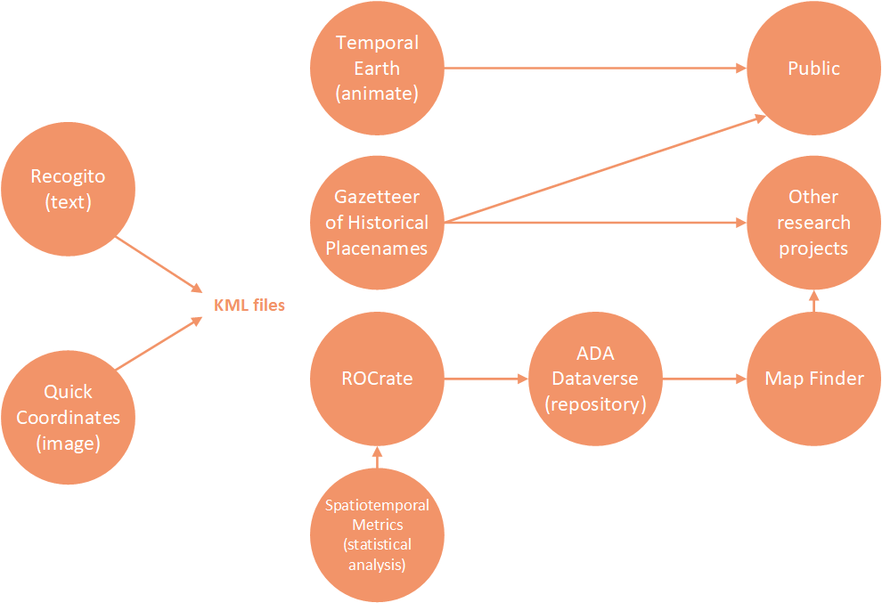
TLCMap is a platform of digital mapping tools that aim to make digital mapping easier for humanities researchers.
TLCMap is in it’s first year of activity, funded by an ARC LIEF grant and we anticipate continuing for a few more years. Our aim in this first year, has been to establish various streams of development to cause a ‘step change’ in digital mapping technology for humanities to take it to the next level. The changes we make we hope can be carried on or emulated by others. Development is driven by researchers’ project needs to ensure usefulness, and done in such a way that the software can be re-used for other similar projects.
Our intention is not to compete with any mapping systems, nor to duplicate any functionality, but to identify areas where it doesn’t meet humanities researchers needs. GIS systems are often developed by and for science, engineering, military and government so there are areas where humanities researchers find it lacking. We don’t have the large budgets of those areas so cannot develop from scratch. Humanities needs are very diverse which makes it difficult to identify and prioritise development that will be most useful to most people. We find also that areas of need are at different stages of capability – from needing a few adjustments, to having to design and develop from scratch. With these challenges, our approach is to add to, augment and adapt existing technologies. By keeping interoperability as a top priority, we hope to be able to meet diverse needs, across diverse systems.
This means that, for example, we develop from scratch a system for ‘Cyclical Time’, contribute a few features to an already existing system for identifying places in texts, and clean up data aggregated by ANPS to find coordinates for TLCMap, and making it possible for anyone to add their own data to a Temporal Earth visualisation. By ensuring that work done in each of these can be output to each other, what emerges is a large ‘super’ system or ‘ecosystem’ which does have many features which people can construct their own workflow through, according to the particular needs of their project. A person many use any one, or all TLCMap systems, and other mapping systems.
Because we are in our first year of development and launching the first versions of systems on 8/12/2020, there may be a few bugs. We appreciate you letting us know about them by emailing tlcmap@newcastle.edu.au.
Having a broad understanding of the sorts of activities there are in digital humanities mapping helps generate ideas for what is possible in our own research. A review of digital humanities mapping activity in 2018 and 2019 revealed a wide range of projects on different topics, and are not limited to marking information on a two dimensional map. To make sense of this vast amount of activity we found that there are several main themes that digital humanities mapping projects usually focus on, as follows. These are not mutually exclusive and many projects involve more than one theme.
Deep
‘Deep Mapping’ is a field of digital humanities theory and practice. Deep mapping looks at the many ‘layers’ of different types of information about a place, how they interelate and effect each other, and what emerges from those interrelations. In this sense it is related to ecocriticism. The term is often associated with the work of author William Least Heat Moon as a seminal writer. That maps are, or can include, different ‘layers’ of information on different topics (such as a layers about plumbing, income distribution, natural features, etc) is nothing new. Such layering is a crucial technical feature for GIS systems. In humanities, beyond layering, deep mapping looks at the interactions and emergent phenomena from them, such as their causal relations, and in the creation of meaning of place. Soil moisture levels, for example, effects patterns of settlement and demographics, which lead to historical events, which effects the way people percieve themselves in that place and the conversation they are having at this moment, which may come, in turn, to effect soil moisture levels. The ideal of the sublime in 19th Century English romanticism lead poets to the Lakes District, which became a crucial part of English culture and national identity, which lead to a tourism industry causing a lot of people to hike there, which resulted in my visiting my brother working there as a night porter where he told me about the poets and I read them, and also resulted in academics producing a ‘deep mapping’ project ‘Mapping the Lakes: A Literary GIS’ which may in turn influence people’s interaction with the country. While it is a recent term, in respect of the close connection between all facets of life linked together through country, it is clear that Aboriginal people have long been experts in ‘deep mapping’.
Data
Many mapping projects focus on the data behind the map, whether data analysis has produced the map or the map is an interface to access or process the data. A common example is where there is a database of information and the map is a visualisation of it, or a way to structure and organise information, and clicking the map gives you access to information in the database. Heurist can be used to create complex databases with map interfaces. With HuNI you can search across selected humanities collections and create networks.
Quantitative analysis of spatio-temporal information can also be seen as having a ‘data’ focus. When doing statistics on spatio temporal information, be aware that you cannot simply, for example, take the average of latitude and longitude to find a mid point. The earth is curved. A distance in longitude is about 111km at the equator, but 0km at the pole. Places near to each other across the international dateline would seem very far apart if you simply took their difference in the numerical value of their longitude. Eg: two places, at 179° and -179° longitude are only 2° away from eachother, but the difference in those numbers is 358.
Text
Text and text processing have always been one of the main activities in Digital Humanities. Texts can be looked at in two ways. There is an ‘exo’ or ‘macro’ level, or ‘distant reading’, where we look at spatiotemporal information about texts, such as books or articles – this could be when and where they were published and distributed and who wrote and read them. At the ‘endo’ or ‘micro’ level the text itself can be processed for spatiotemporal information, as in stylometry. A common concern is the automated computer recognition of placenames using Named Entity Recognition (NER). NER uses algorithms that might use grammatical rules, or statistics and by matching a gazetteer, to try to identify firstly if a word is a ‘named entity’, such as a person or place, and secondly which person or place, usually associating them with coordinates to produce a map. NER for places is usually inaccurate and so requires error correction with a user interface. There are especially many problems for colonised places, like Australia, where many names are used from the ‘old country’. It can be very difficult to automatically identify which country a place is.
Virtual Reality
There’s a wide range of ways in which virtual reality and augmented reality relate to time and place, such as modelling and simulating historical architecture and virtual environments, for research, education, games or virtual tourism. Virtual reality can raise basic questions about our movement and relationships in space and time and present challenges about how we represent and interact with the past imagined worlds and each other.
Virtual reality technology is something that you can teach yourself if you have time. Perhaps the main drawback for researchers it that the technology is all proprietary. The lack of open standards for describing, transferring and storing VR information makes it difficult develop, advance and use the technology. It also means a significant investment of money and effort might quickly become redundant, unusable, innaccessible and unrecoverable.
These tutorials by Rebecca Kerr can be used to create virtual exhibits related to places, such this exhibit of the wreck of the Batavia provided by Erik Champion:
Media
A common aim in humanities mapping is to geolocate collections and archives of images, texts, audio or video files. Many online collection and archive systems already have built in features or plugins to enable this.
‘Maps’ come in different forms – songs, dances, hand sketches, art, etc which may be stored as images, audio or video. Many humanities requirements involve making connections and associations not only of some media to a place (such as a photograph in a collection) but among points within these media – such as a hand drawn map or a point in a recorded narrative and a modern satellite map, to a map. These associations can be across all kinds of media, not just to a GIS system. For example, an image of an old map might be related to a ships journal and both might be related to a map. Parts of a recording of a story might be connected to points in a painting which might be connected to sections of a line on a map showing the path taken while the story was told. Often interacting with particular kinds of data requires an application of some sort – this may be a simple image viewer that highlights the relevant points, or a complex set of transcriptions, translations, glosses and notes arranged in parallel.
In this example from the ELDTA Archive points in a audio recording are ‘mapped’ to points in linguistics glosses and translations.
In this example from a project about a Mixtec tree glyph places on a digital map are ‘mapped’ to pictures of their glyphs in codices.
Mobility
Many humanities research projects involve movement from place to place, such as immigration, songlines and seasonal movements, tour circuits or movements of convicts.
Crucial to interoperability is open standard file and communication formats. With data structured in a commonly accepted way, information exported from one system can be imported to another. These mutually understood, agreed and widely adopted formats make it possible for information to be exported from one system to another. As a digital humanist it is important to understand what these formats are.
It’s useful to have some understanding of the inner workings of the tools you are using, so that when there is a technical glitch you can find and fix the problem. If you are a beginner you don’t need to know everything about what is inside a KML file. You just need to get the general idea, so that if there is a problem with your file, you know where to start and can search the web for the details.
If you want a deeper understanding of KML see Google’s KML Tutorial
Everything in a KML or XML file is wrapped in ‘tags’, which are in < > angle brackets. These are like instructions to the computer to tell it what something is, so it knows what to do with it. You need to tell the computer when something starts and ends, so every opening tag has a closing tag.
For example, the <name> tag will tell the computer that the word inside is a ‘name’ so that it can do the right thing with it, such as display it. Once opened it must be closed or the computer won’t know where the name ends. The closing tag </name> has a slash in it. So in KML, this tells the computer that the ‘name’ of a place is Uluru:
<name>Uluru</name>
This tells the computer what the coordinates are, so that it can use those to display the name on a map:
<coordinates>131.03679752609605,-25.347264796527156,0</coordinates>If you put the name inside the coordinates tag, the computer would be confused and give an error, because it expects coordinates to be numbers not letters.
Usually things are made up of other things, so tags are within tags. So in KML, a <Placemark> is made up of a name, a point with coordinates and other things, so the Placemark tag encloses other tags.
The following is a very simple KML file that would put a point on the map.
It begins with an XML declaration because KML is compliant with the widely adopted mark up language, XML.
It then declares a ‘placemark’ element with a name, description and point coordinates.
Copy and paste this into a plain text document and save it as ‘uluru.kml’.
Double click the file and it should open in Google Earth Pro (if you installed it – free).
<?xml version="1.0" encoding="UTF-8"?>
<kml xmlns="http://www.opengis.net/kml/2.2">
  <Placemark>
    <name>Uluru</name>
    <description>Australian landmark.</description>
    <Point>
      <coordinates>131.03679752609605,-25.347264796527156,0</coordinates>
    </Point>
  </Placemark>
</kml>
Normally KML files use 3 basic geometries of points, links and polygons. They can get complicated to do much more, including complex shapes and 3 dimensions. What does the following do?
<?xml version="1.0" encoding="UTF-8"?>
<kml xmlns="http://www.opengis.net/kml/2.2">
  <Placemark>
    <name>The Pentagon</name>
    <Polygon>
      <extrude>1</extrude>
      <altitudeMode>relativeToGround</altitudeMode>
      <outerBoundaryIs>
        <LinearRing>
          <coordinates>
            -77.05788457660967,38.87253259892824,100
            -77.05465973756702,38.87291016281703,100
            -77.05315536854791,38.87053267794386,100
            -77.05552622493516,38.868757801256,100
            -77.05844056290393,38.86996206506943,100
            -77.05788457660967,38.87253259892824,100
          </coordinates>
        </LinearRing>
      </outerBoundaryIs>
      <innerBoundaryIs>
        <LinearRing>
          <coordinates>
            -77.05668055019126,38.87154239798456,100
            -77.05542625960818,38.87167890344077,100
            -77.05485125901024,38.87076535397792,100
            -77.05577677433152,38.87008686581446,100
            -77.05691162017543,38.87054446963351,100
            -77.05668055019126,38.87154239798456,100
          </coordinates>
        </LinearRing>
      </innerBoundaryIs>
    </Polygon>
  </Placemark>
</kml>
CDATA
Sometimes non alphanumeric characters, or characters not in the Latin alphabet, can cause glitches in KML. This can be annoying if you want to use languages other than English, or simply use an & or angle bracket <. As in any XML document, ‘CDATA’ can be used to start and end a section that has textual content that can be anything you want, not necessarily valid XML. Often we use it to put in HTML, the web markup language, so we can, for example, display paragraphs and headings in a pop up.
<kml xmlns="http://www.opengis.net/kml/2.2">
  <Document>
    <Placemark>
      <name>CDATA example</name>
      <description>
        <![CDATA[
          <h1>CDATA Tags are useful!</h1>
          <p><font color="red">Text can be <i>formatted</i> and
          <b>styled</b> and you can use any HTML or language you like here. ???? ?? ???? ?? ????? ???? </font></p>
        ]]>
      </description>
      <Point>
        <coordinates>151.770978,-32.927247</coordinates>
      </Point>
    </Placemark>
  </Document>
</kml>
Style
You might want the markers you draw on the map to look a certain way, either to make your map look cool, or to convey information, such as different categories. You can do this first by defining a style, then by applying that style to the Placemark. Note that the Style element has an id. To apply this style to a placemark, you set the Placemark’s styleUrl to be the same as the Style’s id (preceded by a hash sign). In this case the id is transBluePoly, so under Placemark we set styleUrl to be #transBluePoly. Normally style information is created by some system that lets you pick icons or colours, but it can be useful to understand it so that you can look into why it might display the style ok in some systems but not others.
<?xml version="1.0" encoding="UTF-8"?>
<kml xmlns="http://www.opengis.net/kml/2.2">
  <Document>
    <Style id="transBluePoly">
      <LineStyle>
        <width>1.5</width>
      </LineStyle>
      <PolyStyle>
        <color>7dff0000</color>
      </PolyStyle>
    </Style>
    <Placemark>
      <name>Building 41</name>
      <styleUrl>#transBluePoly</styleUrl>
      <Polygon>
        <extrude>1</extrude>
        <altitudeMode>relativeToGround</altitudeMode>
        <outerBoundaryIs>
          <LinearRing>
            <coordinates> -122.0857412771483,37.42227033155257,17
              -122.0858169768481,37.42231408832346,17
              -122.085852582875,37.42230337469744,17
              -122.0858799945639,37.42225686138789,17
              -122.0858860101409,37.4222311076138,17
              -122.0858069157288,37.42220250173855,17
              -122.0858379542653,37.42214027058678,17
              -122.0856732640519,37.42208690214408,17
              -122.0856022926407,37.42214885429042,17
              -122.0855902778436,37.422128290487,17
              -122.0855841672237,37.42208171967246,17
              -122.0854852065741,37.42210455874995,17
              -122.0855067264352,37.42214267949824,17
              -122.0854430712915,37.42212783846172,17
              -122.0850990714904,37.42251282407603,17
              -122.0856769818632,37.42281815323651,17
              -122.0860162273783,37.42244918858722,17
              -122.0857260327004,37.42229239604253,17
              -122.0857412771483,37.42227033155257,17
            </coordinates>
          </LinearRing>
        </outerBoundaryIs>
      </Polygon>
    </Placemark>
  </Document>
</kml>
Many digital mapping projects, particularly in history, plot events in places and times, typically with an interactive timeline. Time is particularly important in humanities as we are often interested in the history of our subject area – how ideas formed, or how things came to be as they are, as a basic aspect of critical inquiry.
Vagueness
Most spatial systems that handle dates allow for either a point in time, or a time span with a begin and end date. A common problem in humanities, mentioned by many researchers is vagueness, yet computers require precision. A time might be ‘late that Winter’, or ‘early in the 19th century’ or ‘one afternoon’. If we want the computer to display something at a time or place, we still have to tell it when and where, in our estimation it should do that. One way to handle vagueness is to use the ‘begin’ and ‘end’ of a time span to indicate the range within which the date might have fallen such that ‘late in the rainy season of 2020 in Darwin’ might be expressed as begin: 2020-03-01 and end: 2020-04-30. You can put any qualifying and explanatory information in notes, descriptions and commentary.
Problems with Dates
A common problem when dealing with time is the use of different time formats by different countries and by software systems. US dates are often in the format MM/DD/YYYY, with the month at the beginning. A lot of software is developed in the USA so this is sometimes the default setting and assumption. This can lead to a lot of confusion as we move date information around systems, as the 4th of January can easily be changed to the 1st of April without us noticing. It is usually possible to change default software settings to a region with an unambiguous format such as DD/MM/YYYY or YYYY-MM-DD (in TLCMap systems we don’t make allowances for US dates).
Always check the dates have not been corrupted or changed by different formats when moving data between systems.
Another common problem is that many databases, and so the software applications built on them, have a ‘date’ datatype that does not go back very far into the past. They often can’t handle dates with three numbers in the year, such as the 1st of April in the year 786 (786-04-01 or 01/04/786), or BC dates such as 65,000BC. These problems can be worked around by software developers, but it requires extra effort and so expense. Because it is crucial for many humanities projects, in TLCMap software we try to ensure any date can be entered.
Date Formats
TLCMap systems aim to support several formats of date and we encourage others to support these formats at a minimum:
- YYYY: Often, the year is the only date information a person has, and it is onerous and misleading to add MM/DD to it, such as to indicate every such date as 01/01 of that year. However, some systems cannot function without the DD/MM part of the date. If this is the case the suggested work around is to use a timespan that begins YYYY-01-01 and ends YYYY-12-31. If only a single date can be used, use YYYY-01-01.
- YYYY-MM-DD: This is the preferred date format, compatible with ISO 8601. It is clear, unambiguous and easy to sort.
- DD/MM/YYYY: Some systems, notably MS Excel which is likely to be used for CSV files, automatically converts dates in other formats into this format, such as when saving as CSV. Since so many people use Excel for data it would be deeply frustrating if this format isn’t supported.
NOTE: For all of these formats a hyphen can be used as a minus sign for BC dates. It must allow for use of 0s to infill, or less that four digits. (eg: 12BC could be -0012 or -12. 10,000BC would be -10000).
Conceptualising and Structuring Time
The most common representation of time on maps is a timeline, or ‘time slider’, which can be moved back and forth to show events at places at different times. While this is very useful for many cases there are other ways of conceptualising or structuring time in relation to space that we are likely to encounter in Humanities. Because GIS systems are focused on space, they most support they provide for time is usually limited to a time slider. Other ways of conceptualising time are less well represented in technology, to varying degrees.
Through our work on TLCMap we have found the following ways conceptualising time are required by Humanities researchers. These will need to be accompanied by ‘structures’ implemented in open standard formats.
Journey
A series of points in a line visited at various dates and times. This is distinct from ‘ordinal’ time (below), where we describe a series of places that may be visited in order, as on a journey, but not at any particular date or time.
Examples:
- A ship visiting different ports at different times, recording it’s coordinates at various times in its log.
- A person hitch hiking stopping at various points on the way.
Migration
Movements of certain amounts from place to place at different times. This is distinct from a journey in that we are interested in the amount of something moving from place to place over time.
Examples:
- >How many people migrated from each country in the world through each decade of the 20th century, arriving at which cities?
Frontier
A line or polygon that moves over time.
Examples:
- The Western Front in World Wars I and II.
- The area being burned by a bushfire.
Stationary
Places that don’t move but change in various ways over time. The properties or attributes of things may change in a way that can be visualised, or analysed.
Example:
- Over time cinemas in a city are in buildings that don’t move, but may open and close, change their ownership, their audience numbers decrease and increase and they might start or stop showing different types of film.
Cyclical
Repeated events which occur at regular intervals. Cyclical time can be quick complex with cycles within cycles and overlapping phases.
Examples:
- Festivals and rituals that occur at different seasons or times of the year, or every few years, such as east coast Aboriginal peoples tending to move inland to cooler highlands for hunting in summer and to the coast for fishing in winter, and attending the Bunya festival every three years.
Ordinal
A series of steps that occur in a specific order but not any particular time.
Example:
- Instructions to go from one place to another (go down the road to the intersection, turn left until you reach the shop, then go to the end of the bridge near the big tree, etc)
- The order in which places are mentioned in a book or set of newspaper articles.
Calendar
Events which occur on a particular date or time.
Examples:
- Appointments made in your journal or booking system. Calendaring is probably the most well implimented temporal concept in IT but in humanities we may be also be concerned with complicated issues with alternative calendaring systems, such as the French Republican calendar, or the ancient Mayan calendar.
Space Time Warping
Distance can be thought of not only spatially but temporally, or a combination of both. The distance from one place to another, is sometimes recorded in travel time, rather than kilometres for example. Maps can be ‘warped’ to visualised distances according to time rather than space. Bear in mind that travelling in one direction may take longer or shorter than travelling back (such as travelling with or against prevailing winds and currents).
Examples:
- Medieval itineraries, or travel guides, indicate how long it will take to get to each point on a journey, which is important for provisioning.
- Features to get direction in online trip planners usually indicate travel time as well as distance.
- Certain kinds of maps such as isochrones can depict travel time by indicating radiating regions or by distorting spatial relations.
The following areas present their own set of technical and theoretical difficulties so can be treated as areas of development and enquiry, though all of the above ways of thinking about time may apply.
Eco-geological
Representing ecological factors or change at the scale of geological time can
Examples:
- Representing changing coastlines.
- Showing ecological zones that would exist without human habitation, or how they change over millenia.
VR Time
Space and time are fundamental to creators and users of VR, even at the most basic levels, such as the speed at which the user moves. Reconstructing places and objects from history or for heritage are common interests for Humanities VR, and various ways of visualising changes in those things over time presents challenges.
Examples:
- Controls for moving around VR environments.
- Constructing historical buildings or game environments for people to move through.
TLCMap for the first time provides access to almost all the placenames in Australia including historical placenames, based on the Australian National Placenames Survey. It has two main purposes:
- Search and filter to find places in Australia using the ANPS Gazetteer, which aggregates state gazetteers and includes historical data.
- A spatio-temporal index of Humanities information – you can contribute humanities research so others can find it.
You can also:
- Visualise search results and contributed datasets on a 3D map, or timeline.
- Export results and datasets as KML or GeoJSON for further research.
Try these searches
- Places named exactly, ‘Newcastle’. Use ‘exact’ search.
- Places starting with ‘Coo’ in south east Queensland.
Use ‘fuzzy’ search and draw a circle around SE QLD. (I found this useful when trying to figure out the meaning of a place name in SE QLD.) - Search for any community contributed layers relating to ‘Darwin’.
Either type in Darwin or draw a circle around Darwin. Select ‘Layers’ and not the ‘Gazetteer’ options. - Places containing the word ‘Chinaman’, ‘Chinamen’.
Make a text file containg these words and upload it at the bottom. Use ‘contains’ search. (Places such as “Chinaman’s Gully” were often named after market gardens and settlements so this provides a clue to the history of Chinese settlement.) - View search results in 3D Viewer.
There is a button near the top to view the whole dataset, or you can click to view each individual point. - Download the search results as a KML file, or CSV spreadsheet for further research.
You can open KML in other mapping applications, or CSV in Excel.
Contribute Data
When you have done some research involving places, adding it to TLCMap means other peopled doing searches can find it. This adds to the overall appreciation of the meaning of places and of culture in general in Australia, as layers will build up and intersect.
- To contribute your data Register to create an account and then create a dataset. At the top left click ‘Account’ and choose ‘My Datasets’. Click ‘Contribute new dataset’. Detailed step by step instructions are available in the Guide.
- Add as much or as little metadata to your dataset as you like. Licencing and sourcing information is especially recommended.
- You can set it to private while you are working on it, and make it public when it is ready. In general, research is never completed, and you can continue working on datasets in the TLCMap, or replace with improvements, so it’s good to make it public as soon as it is ‘good enough’ even if not perfect.
- You can enter records directly to your dataset (useful if you just want to add in a few places, such as placenames not in TLCMap) or you can upload data from a CSV or GeoJSON file.
- At present the recommended way to add data is to pre-process it in TLCMap Quick Coordinates, and export as KML. This also gives you the option to include any extended data you want, and to enable animation of journeys if desired.
- If the data relates to other information that is online, such as records in an online database, images in an online collection or otherwise, it’s good practice for your uploaded dataset to include URLs that can link back to the resource related to that place. This helps drive traffic to those resources and your research.
- TLCMap is not an archive. It is more of a spatio temporal index to humanities and cultural information. Even if you are working only within TLCMap you can export the data and add it to an official archive, such as your University archive, ADA Dataverse or other data repositories.
- Don’t upload secret data or other people’s information without permission.
Technology means knowledge about ‘how to’ do things. In philosophical terms it can be contrasted with knowledge about what exists (metaphysics/ontology/sciences), what should be done (ethics) and what counts as valid knowledge (epistemology). Digital maps, as technology, enable us to do things, whether we are the map maker or the map user. Since they enable things to be done they necessarily involve ethics – if you can do something questions immediately follow about whether you should you do it, who can do it, and who it effects.
There have been a few high profile scandals about large IT companies like Facebook and Google conducting unwanted surveillance, surveillance without consent, monitoring movements, conversations, browsing habits, or the manipulation of social media in politics. There has been criticism of surveillance capitalism and so on. Google street view and high resolution maps such as Google Earth and ArcGIS can make it easier for anyone to conduct some level of surveillance on anyone. When you tag your friend in a photograph you might be assisting facial recognition software that could be used in government or corporate surveillance without that person’s consent. There is a good chance you are unaware that your mobile phone has been tracking your movements for many years because you didn’t switch off this ‘feature’.
Maps have obvious political uses – they are used to plan and execute wars, for resource exploitation, for exploration and colonisation. Maps and GIS systems are used to target missiles and collect taxes. They are used in treaties, contracts, mortgages, mining leases and native title. In any power relation maps are equally useful in the exercise of command and control and resistance to or subversion of it. Maps are used by invaders and defenders.
Maps can be used to surveille, and can also be used to show things that were hidden, or to expose injustices.
The Colonial Frontier Massacres map, for example, revealed to many Australians and the world, the wide ranging extent of massacres in Australia. In many cases these events were covered up by the perpetrators and absent from our history books.
Maps meant for one purpose can be used for another. Maps may by charity workers of where people were sleeping rough in London were used by the goverment to target people for deportation.
Maps can be used to assert what exists, or does not.
Maps tell a story.
Maps can help establish a personal connection with events. Part of their power is that of the ‘image that tells a thousand words’. Maps condense information into something that can be easily understood at a glance or with little interpretative effort, in contrast to reading an essay or book. This can help get a message across about the scale, reality and seriousness of a situation. Interactive digital maps, like The Uprooted add the ability to ‘drill down’ into specific details to appreciate nuances and individual stories that can help create a more ‘inter-subjective’ response, recognising the humanity of the people involved, so that statistics, rather than being numbers glossed over, come to represent the magnitude of that many individual stories.
Maps situate us in relation to the world. When we look at a map, our first thoughts are often, “Where am I?”, “What on this map is near where I live or grew up?” or we imagine if we were there in that particular place. They establish a personal relation, and relating to real places in the world, helps convey a visceral sense of ‘the real’ in a way that can be lacking from statistics or arguments developed in text. Maps can encourage an ethical attitude with places and people.
By showing some things on a map, they can sometimes also demonstrate there is more to a place beyond what we thought. Having read (or heard) a map, places mean something. We start to read the country. In ancient rhetoric people remember speeches by imagining the things they are going to talk about being in particular familiar places, like their house, or town. Remembering the places on the journey helps us remember the story, the law, the philosophy, whatever it may be, associated with them. Each reinforces the other – the story helps us remember the place and the place helps us remember the story.
In terms of digital humanities practice, digital maps can provide access to details and supporting information in ways that are difficult in print. Interactivity means that viewers can click on points to obtain more information, statistics, narratives, images or anything at all. This functionality can help to:
- demonstrate your argument with supporting material
- develop a more subjective and ethical interaction
- provide the map as a research tool for others
As part of ‘actor network theory’, Bruno Latour in Pandora’s Hope (1999) describes how the combination of objects or machines and people generates sets of possibilities that otherwise would not exist if each remained seperate. The amalgum of person + object is a new ‘actor’ with new possible actions. In one example he describes how when an angry person is combined with a gun, the possibility of murder may emerge where before it was not possible. Some might argue that a person who wants to murder can murder with a stick or a stone, and that such objects are not in themselves causes of murder. Yet a gun, unlike a stick, is specifically designed to enhance the ability to kill. Making guns available makes killing much more of a possibility – that’s the point of a gun.
Technology typically enables people to do things in some enhanced or improved way, easier, faster or in greater quantity or more cheaply, whether it is turning on a light, curing people of disease or destroying the world at the push of a button that launches a nuclear missile. When making technology, such as a digital map, then we cannot completely absolve ourselves of responsibility for what is done with that technology. Even if we are not directly responsible for it’s use, we bear some responsibility for what we enable to happen, particularly if it is meant for that specific purpose. Needless to say the ethics of any map making depends much on the particular scenario.
Every mapping project is different, so there can be no summary or simple answers in this introductory course, except to say that developers of technology enable actions that would not have otherwise been possible and so, even if they may not be directly responsible, cannot absolve themselves of responsibility, and must consider carefully the ethical implications of what they do. When doing your digital humanities mapping project consider these questions:
- What is shown?
- What is omitted?
- How does this contribute to what power relations?
- Who can use this map and who cannot?
- What does it enable them do?
- How does that effect other people?
TBC – this tutorial will later include a worked example, showing comparison of metrics from different datasets.
Convert a KML file you have created into GeoJSON by searching the web for a KML to GeoJSON converter.
Log in to STMetrics
Choose ‘basic statistics’, load the GeoJSON file. Note the midpoint, area, and other statistics.
The prototype of STMetrics is being revised for inclusion in TLCMap in the coming year.
Why Map?
- For some disciplines maps have always been a crucial part of understanding the subject area, in history for example, maps of battles, political, cultural and socio economic boundaries and spread across time, are crucial. In linguistics, maps of language distribution are common. In Archaeology maps of sites are at the core of practice. In 21st century literary criticism, within ‘distant reading’ and ‘ecocriticism’ there has been a surge in interest in maps.
- Maps provide a visualisation that enables us to see patterns we would not have otherwise seen, and so to make research discoveries.
- The act of making a map, as with digital humanities, can have the side effect of adding methodological rigour to research.
- A map produced by your research is not only a research outcome but becomes a research tool for someone else.
- Maps are good for disseminating research, as they can convey information at a glance, in a way that a long text cannot. Web maps are often interactive. The visual and interactive aspects of web maps and the personal relation people have to places make them interesting and engaging to the public.
Considerations For A Mapping Project
Many of the considerations of a mapping project are similar to other DH projects. The following are all important considerations before starting a project. More importantly, don’t let uncertainty about these questions stop you from starting a project. The sooner you start the sooner the answers to these questions become clear. Try to build an end-to-end working draft (‘proof of concept’, ‘prototype’ or ‘feasibility test’) as early as possible. Problems can be solved, but time and effort must be allocated.
- Can we just use an existing system or do we need to build and customise our own system?
- What technology is appropriate for the project?
- What metadata is needed for each location or event?
- What consistent format is the data going to be in? (eg: coordinate system, date time as dd/mm/yyyy)?
- What is the structure of this data?
- What open standards will be used to make sure it’s all interoperable and re-usable?
- How will the data be stored, maintained and accessed?
- Is this about mapping points, lines and/or areas?
- Is there a time dimension?
- Are the locations connected to text, images or multimedia that needs to be linked to somehow? Where is it stored? Are there copyright constraints on using it?
- How long will it take to collect all this data?
- Can we afford it?
- How will we manage scope creep?
- When it is finished, who will maintain it, answer questions about it, apply corrections to content in it, fix bugs, add features, apply security patches, and restore it if it goes down? And at what cost and who will pay?
Caveats
We often need to deal with vague locations in source materials (eg: 3hrs north of the creek)
If you map from primary sources, such as journey narratives, do you map where they thought they were, or where your best estimate is of where they really were? Or both?
There is a difference between accuracy and precision. Eg: a coordinate may be precise to 6 decimal places, but only be accurate to 3 decimal places.
There is a lot of material and software that we might have assumed to be available but isn’t but that is why this is an interesting research field. There are still important problems to solve, and those technical solutions will lead to discoveries that have not yet been made.
We might build a map in order to spot patterns but keep in mind all the factors that might influence patterns. Are we seeing differences in what we are studying, or just the population distribution? We might see a cluster of dots and think it significant, but if travel time is a factor, it may only be because those sites are in the mountains, and considering travel time, they are just as clustered as events spread out across a flat region.
If time is a dimension in our data, what if an event occured over an extended period? Or at multiple times? Or at the same time at several locations? (nothing is ever simple).
Statistics on coordinates are very hard. One does not simply average latitude and longitude. Points 10 degrees apart in longitude are much closer together than near the pole. This will skew statistics unless we do some complicated trigonometry.
Exceptions to the rule. Normally in software and STEM areas we are concerned with fitting everything to a consistent structure for ceteris parabus, repeatability of experiment or to meet the 80/20 rule in profit maximisation, as part of 6 sigma quality assurance etc. In Humanities it is often the exceptions to the rule, highly contingent instances, marginal cases, resistance to structure, or the changes in structure itself over time, that we are interested in. In humanities mapping, as in DH generally, we must be prepared to put in the extra effort to handle these exceptions sometimes in conflict with usual IT or commercial practice, or at least offer an explanation about how they relate to our generalised processing. It might be a matter of applying the 80/20 rule of applying a standard approach to as much as possible, but making sure we also cater for the other 20 instead of excluding them. This may require hacking, adding on to, or sometimes just adding explanatory and contextualising information.
for Digital Mapping for Humanities course
Click the answer
Maps are:
pictures of geographical places
associations of numbers in one set to numbers in another set
stories describing how to navigate
Google My Maps can be used to:
Draw points with information attached.
Draw curved lines.
Make a map available on the web.
Georectification is:
Finding coordinates in latitude and longitude from some other information or device, such as with a GPS or from your computer’s IP address.
Providing coordinates for some object or name. Usually this means finding the latitude and longitude from a street address. To process a large amount of addresses may require using a paid service.
Adjusting a map to a coordinate system. This usually means overlaying an image of a map, such as an old map that might not be accurate, on a digital map and rotating and distorting it to match.
Some standard formats for mapping data are:
KML
GeoJSON
RFC 2324
The correct order to express latitude and longitude is:
latitude, longitude
longitude, latitude
it depends
One reason automated NER has a low accuracy rate is:
Many people and places have the same name
Word frequencies interfere with machine learning
Deep Mapping is about
Geologically analysing samples drilled vertically from the earth.
The interrelation of layers of different types of spatiotemporal information.
The correct syntax to show the name of a place as ‘Indooroopilly’ in KML is:
<name>Indooroopilly<name>
<Indooroopilly>
<name>Indooroopilly</name>
<point>Indooroopilly</point>
According to TLCMap analysis and definitions, which of these temporal structures doesn’t require specific dates:
Journey
Ordinal
Cyclical
TLCMap can be used to:
Search or filter but not both at the same time.
Search for places within a region, with or without a name to search for.
Contribute humanities research related to places, so others can find it.
Which of these assertions do you agree with and why:
The maker of a map is not responsible for what people use it for.
Because so much of modern mapping technology developed through colonisation and is still used to exercise colonial power, it should not be used in the decolonising process.
A particular GIS system enables missile targeting systems that have been used against civilians. This technology should not be used for my mapping project because it would support the provider of that technology and war crimes.
A map that provokes an emotional response detracts from it’s ability to accurately tell the truth.
It’s always good to browse through examples to see what’s possible and get ideas. In a confusing world of different tools, an easy way to figure out how to do what you want to do, is to find a similar project and see what they used.
Listings of DH Map Projects
- Anterotesis provides an excellent listing of DH Mapping projects as well as writings on humanities and software tools
Some Interesting Maps
- Marshall Island Maps
- John Snow’s Cholera Map
- Mapa de Cuauhtinchan 2
- Cooks Map of Newfoundland
- Sumerian Map (oldest existing map)
- Maps of Piri Reis
Pace of Change
Mapping shipping in 2012 and 2016 and wind in 2019*. Like most things on the internet there is now too much activity to have a complete view of what everyone is doing. Focus on the research question and what is needed for it, rather than finding a use for whatever is bleeding edge (we’re doing humanities not looking for ways to apply cool new technologies). Then we see if there is something that does that, and if not, hack, adapt, combine, customise, build it ourselves, bricolage.
Digital Humanities is a rapidly changing field. If you don’t start now and finish soon, it will look old when you are done. The ‘rapid’ approach to software development help handle this difficulty, and also the uncertainty of future funding. Produce a working prototype early, and aim to continually enhance, build upon it and adapt. The project launch must be considered as the beginning, not the end. Too often projects are funded to produce something, which is celebrated with a launch at the end, but which then dies, and the investment of time and energy and emotion is lost for the lack ongoing support and upgrades. The purpose of a DH development project is to reach the end of the beginning – then you move into the maintenance and upgrade cycle/ This can be difficult on a case by case basis, as nobody is likely to want to take on an appointment for a few hours work here and there if needed, and at the same time it might take a new person 2 weeks effort to get up to speed on an application to spend one hour fixing a glitch. I hope institutions will one day realise aggregated support can save millions in investment and that software is a living thing, which once planted needs only a little tending.
Humanities Map Examples
- Virtual Songlines
- Australia’s Vietnam War
- Colonial Frontier Massacres
- ORBIS The Stanford Geospatial Network Model Of The Roman World
- FBTEE: The French Book Trade in Enlightenment Europe
- Digital Harlem
- Brisbane History Map
- The Uprooted
- The Amazonian Travels of Richard Evans Schultes
- Many more ArcGIS examples
- Hills of Donegal
- Geneva, Switzerland
- A map of various story map projects
- Old Maps Online
- Spatial.ly
- Aboriginal Tasmania Story Map
- Napoleon’s advance on and retreat from Moscow Elaborate data visualisation more than just a map, and paints a clear picture of why invading Russia is a mistake.
- Ethno-linguistic map of Africa. Comprehensive detail and rich layers.
- Atlas of Early Printing
- The Kokoda Track
- Icelandic Sagas Maps not only help us find out information about something, but change our experience of it – what we imagine and feel when reading a piece of literature for example. Icelandic sagas are about places as much as people so lend themselves to mapping. Events and time overlap across and within sagas. Piecing together oral stories and anecdotes, you can see sometimes the writer struggling to organise concurrent threads into the serial structure of the codex. These maps, the result of an eco-critical journey, offer an alternative way to explore the weave, perhaps closer to their location and kin focused existence before being written. Because places are relatively easily identified in the sagas, if you happen to be reading Eyrbyggja saga, it’s easy to pick out the particular mountain pass in which Snorri the Priest’s slave waited for his chance to win freedom by killing the man who was paying too many visits to his master’s married sister, and why, since it’s so far to walk from Helgafell he’d had to make an excuse about looking for lost sheep. It’s a great enhancement to the appreciation of the literature being able to see that the mountain which Snorri would sit on because no plan made on it’s summit ever failed is a solitary mountain in the middle of a treeless plain surrounded by sea. It’s also extraordinary to realise how much more populous the farmland was at that time than it is now, and yet how small the population was considering the extent and quality of the literature.
For Developers
Web devs unfamiliar with mapping APIs may find the following useful. Also, check the page for developers.
Javascript APIs for mapping give you both the benefit of solving some common problems easily and the ability to adjust, hack and modify according to your needs – if you have web development skills.
If you don’t, picking up a few beginner web development skills is surprisingly easy, though mastering the wide range of possibility is an endless journey. It’s easy to find some tutes introducing topics, and then working on a specific project hones your skills as you figure out how to do what you want, learning from every bug and error on the way.
W3C offers very straight forward tutorials. To get a foundation learn some HTML and CSS. Then some Javascript. You do not need to remember everything. You do not need to complete the course. You just need to do the first parts and understand what is there so that when you need to do it, you can refer back to it.
With this basic foundation do tutorials with web mapping APIs. Some popular ones include:
- Leaflet (free and open)
- ArcGIS Javascript API (the main ArcGIS software is licensed but the Javascript API is free. Can be used to do 3D terrain and timelines on the web.)
- Google Maps Javascript API (drawback is you need to sign up)
- D3 (lots of visualisation tools, including maps)
Do the GeoJSON with Leaflet tutorial.
Use geojson.io to draw a map and generate some GeoJSON.
Add it to your Leaflet map.
In these exercises we are using the ArcGIS Javascript API because you don’t need to install anything, you just need to paste the code into a file and save it. The Google Maps Javascript API is similar but there are a few differences that might make you choose one over the other. However, the Google Maps Javascript API requires you to set up a Google account and get an API key, which can be a little confusing, and I don’t want to make you sign up to anything to do this course.
Some of the differences in the APIs are (note the differences change as these megacompanies compete aggressively, catching up and outdoing each other):
Google: faster; easy to use; more widely familiar to everyone.
ArcGIS: a bit slower but fast enough; more advanced and richer features if needed such as 3D terrain view, statistics displays etc.
- Look at the ArcGIS tutorial.
- Having read over this (you don’t need to memorise, just get the gist of it) click the link to the Javascript Sandbox
- Copy and paste the code into a text file on your computer and save as HelloWorldMap.html (Make sure that it has not been saved as HelloWorldMap.html.txt. You may need to makes sure it is saving as a ‘any’ type of file, not ‘text’.)
- Double click this file to open it. It should open in your default browser and show the same map. (If it doesn’t open in a browser it’s probably because it saved as ‘HelloWorldMap.html.txt’)
- Change the zoom level and refresh or close and open again to check it loads at the expected zoom level.
- Change the coordinates so that it opens focused on the University of Sydney. (tip: a quick way to get coordinates is to go to Google maps, right click and choose ‘What’s here’ – be careful, sometimes the Google coordinates need to be switched around to work in other systems. If your map doesn’t work, check this first. Ie: the coordinates -33.886056, 151.186281 may need to be 151.186281, -33.886056)
- Change the basemap – look up what basemaps can be used in the API Reference
- Look at this ArcGISMarker.html example that adds a marker, a large red dot, to the map. (TIP: right click and ‘view source’. You can cut and paste this to your own files.). Save this html file on your computer and edit it to change the RGB colour and alpha transparency.
- If you click it, there is a pop up with information. Change what it says.
- Note that you can draw a variety of markers on the map. Usually the standard types are points, lines and polygons.
Working With KML Feeds
If you had more than a few markers it would be clumsy to hard code them all into this Javascript file. It would be very difficult to manage. Often we store all our data separately, in some system for maintaining data, whether that’s a spreadsheet, a GIS system, SQL database, or otherwise. We then want to import that data, and have the Javascript API do its magic to plot all the points on the map.
TIP: a KMZ file is just a KML file that has been compressed. If you want to see what’s inside it change the file extension to .zip instead of .kmz and extract the file by right clicking and choosing ‘Extract all’ or using compression software like 7zip.
Working with KML also makes it possible to add lots of different data from different sources to compare and contrast, to spot patterns and learn new things. It’s also a good way to make your geocoded information available to others. Because it makes it so easy to share data, there should be free KML files with all kinds of info available everywhere, but it remains difficult to find sometimes. Infrastructure such as National Map is designed to address this problem. Geoscience Australia and other services provide useful data that we can compare with humanities information: http://services.ga.gov.au/. Lets just use the URL of our own KML file: http://hri.newcastle.edu.au/courses/mapcourse/EarlyEurasianPhilosophers.kml
- Look at the ArcGIS KML example and, again, make a file on your own computer for it, called kmlexample.html
- Change the URL for the KML to http://hri.newcastle.edu.au/courses/mapcourse/EarlyEurasianPhilosophers.kml
- Set the starting coordinates for the map to be Australia instead of Wyoming.

